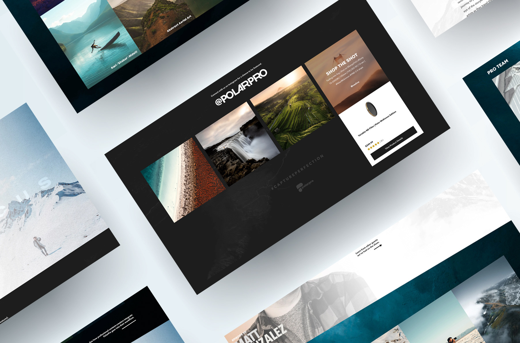
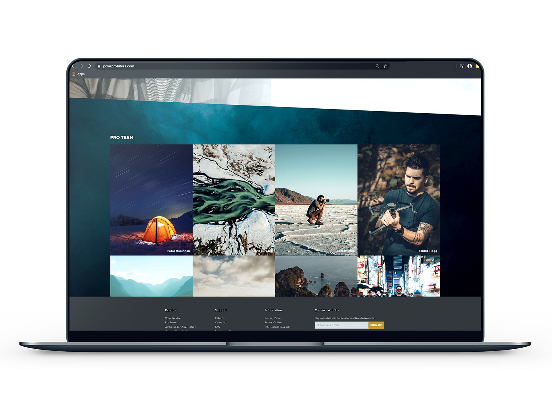
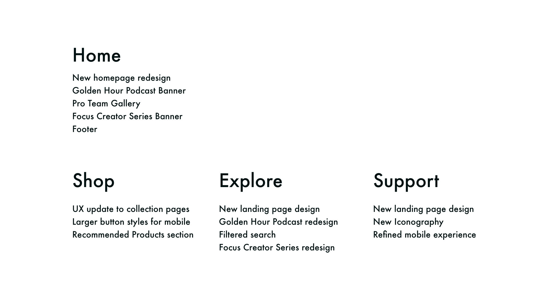
PolarPro Website Redesign
For adventure seeking photographers aways on the go.
The Problem
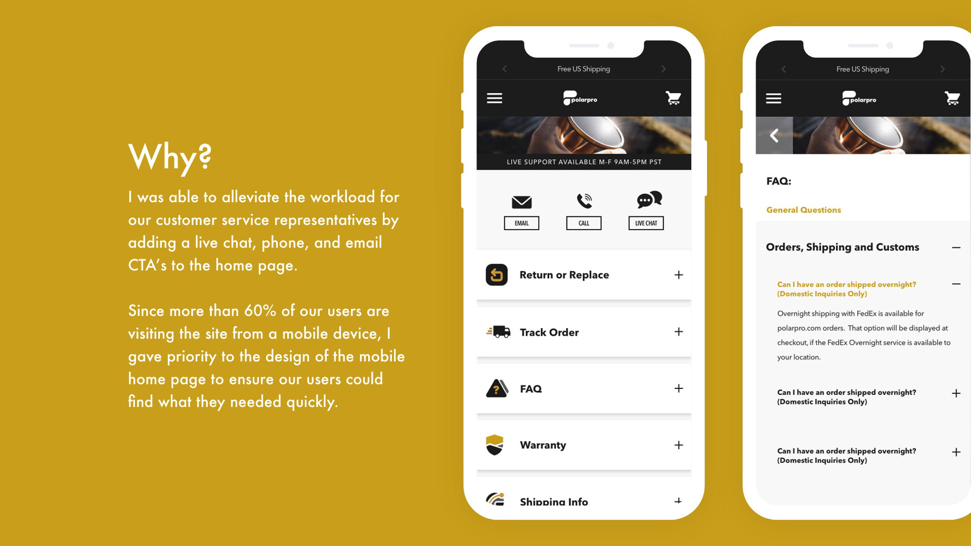
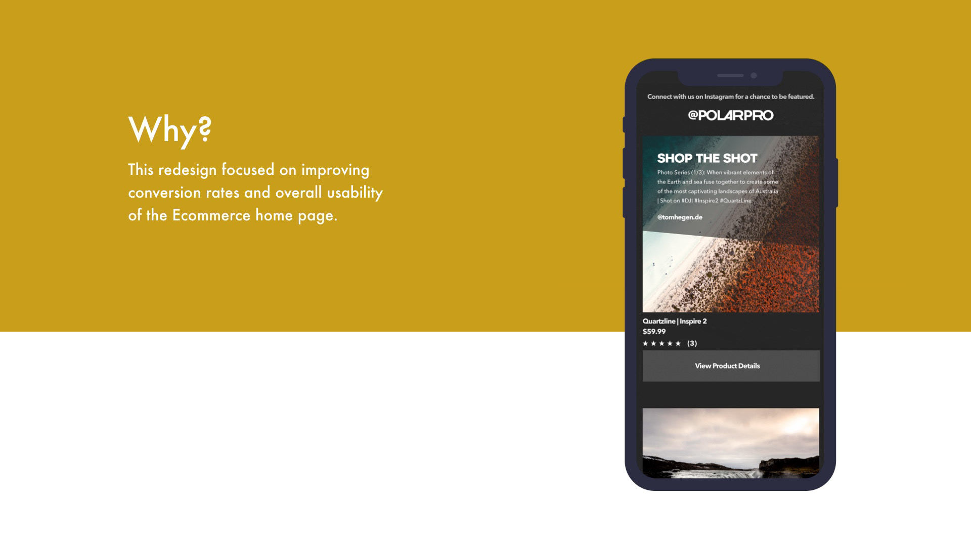
The goal of this project was to increase conversion rates. Prior to this redesign, the home page was static and lacking engagement. They were not using data to drive design decisions for the home page so my goal was to find areas of the website that could be revisited for better conversion rates.
How
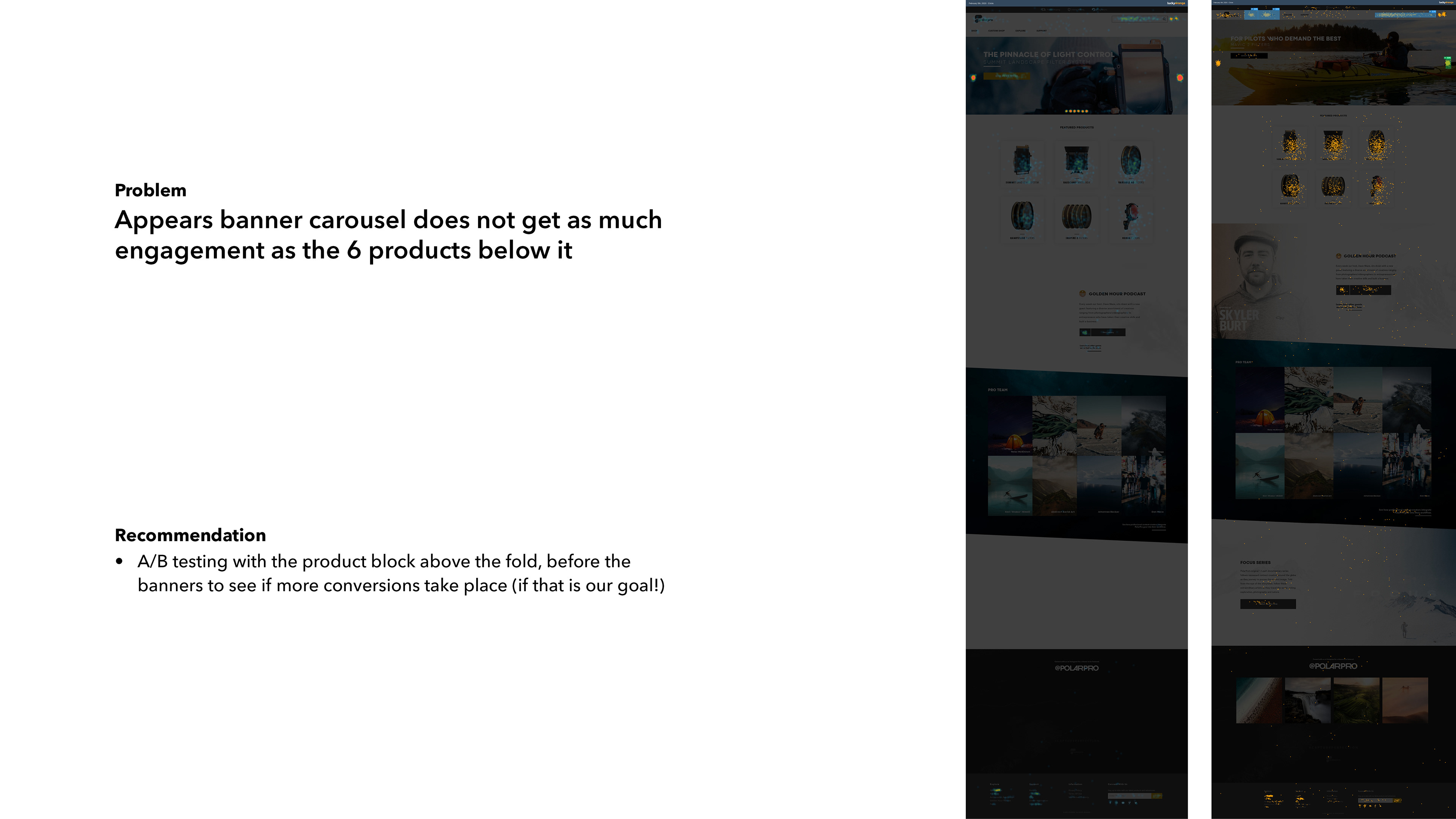
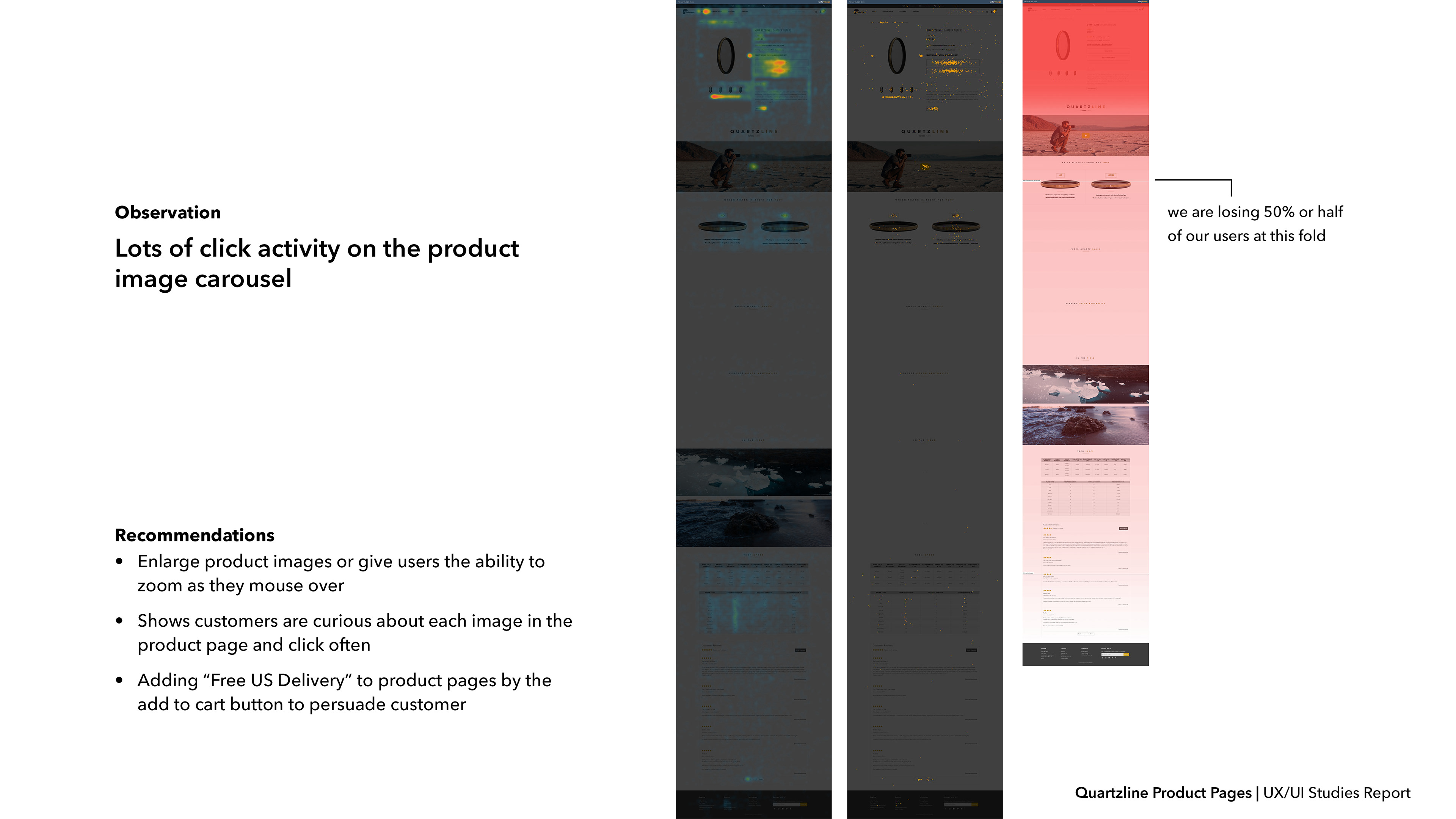
After I conducted a UX audit on the site, I gained information through Google Analytics research that our main customers were mostly older males ranging from ages 27-45. I analyzed click maps and heat maps to gather data on which parts of the site users were interacting most with.
What needed to be done
A UX audit and redesign to improve experience for users shopping on our site.
Research
Which menu items are clicked most? What can I redesign to increase conversion rates?
User Research
Analyzing data to find who our target customers actually are.
Sam, 24

Eric, 32
Carmen, 35
Sam is from Seattle, WA.
Sam is a 24 year old freelance photographer who does both personal and corporate work for many big clients. Shane is still learning and growing into his career but is willing to invest in the latest and highest reviewed filters.
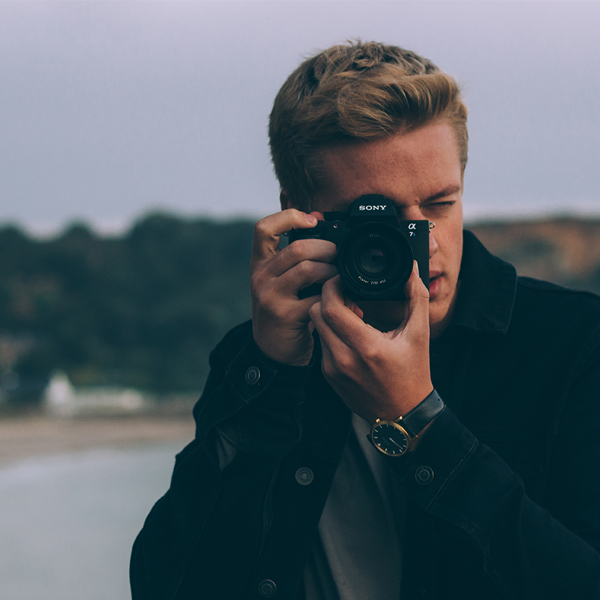
Eric is from Newport Beach, CA.
Eric is a 32 year old landscape architect who owns his own business. He brings his camera with him everywhere since he is usually bouncing between job sites and locations. Eric appreciates quality and doesn’t mind spending top dollar on the latest camera gear because he knows he will get good use out of it.
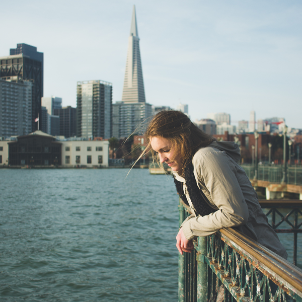
Carmen is from San Francisco, CA.
Carmen is a 35 year old mother and wife living in San Francisco. She is a freelance wedding photographer and cherishes her evenings and weekends with clients when she can get away from her home life. She doesn't buy products frequently, but will make one large purchase every year.
Wireframing and Prototyping
To get users engaged with the media portion of the site and purchase more products.
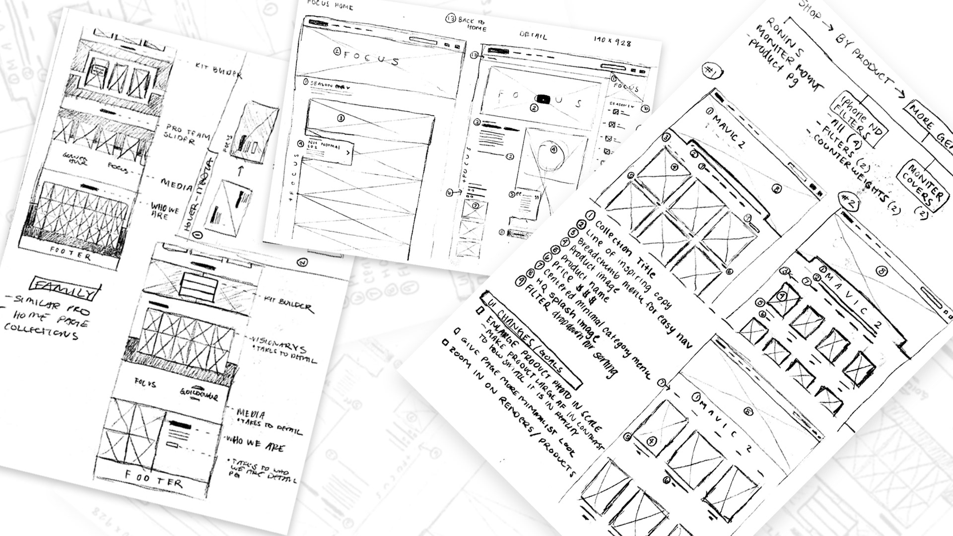
Low Fidelity Wireframes
High Fidelity Wireframes
High Fidelity Wireframes
High Fidelity Wireframes
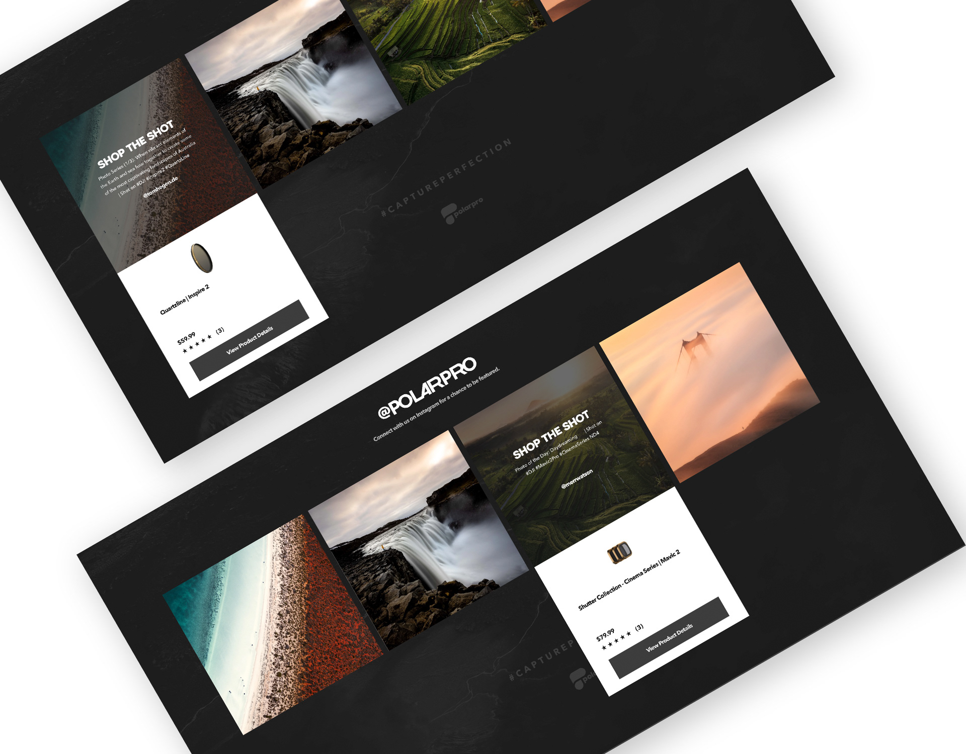
Final Experience
For adventure seeking photographers aways on the go.
Shop UX Improvements
Spend less time finding your gear on the website, and more time putting your gear to use.
The Problem
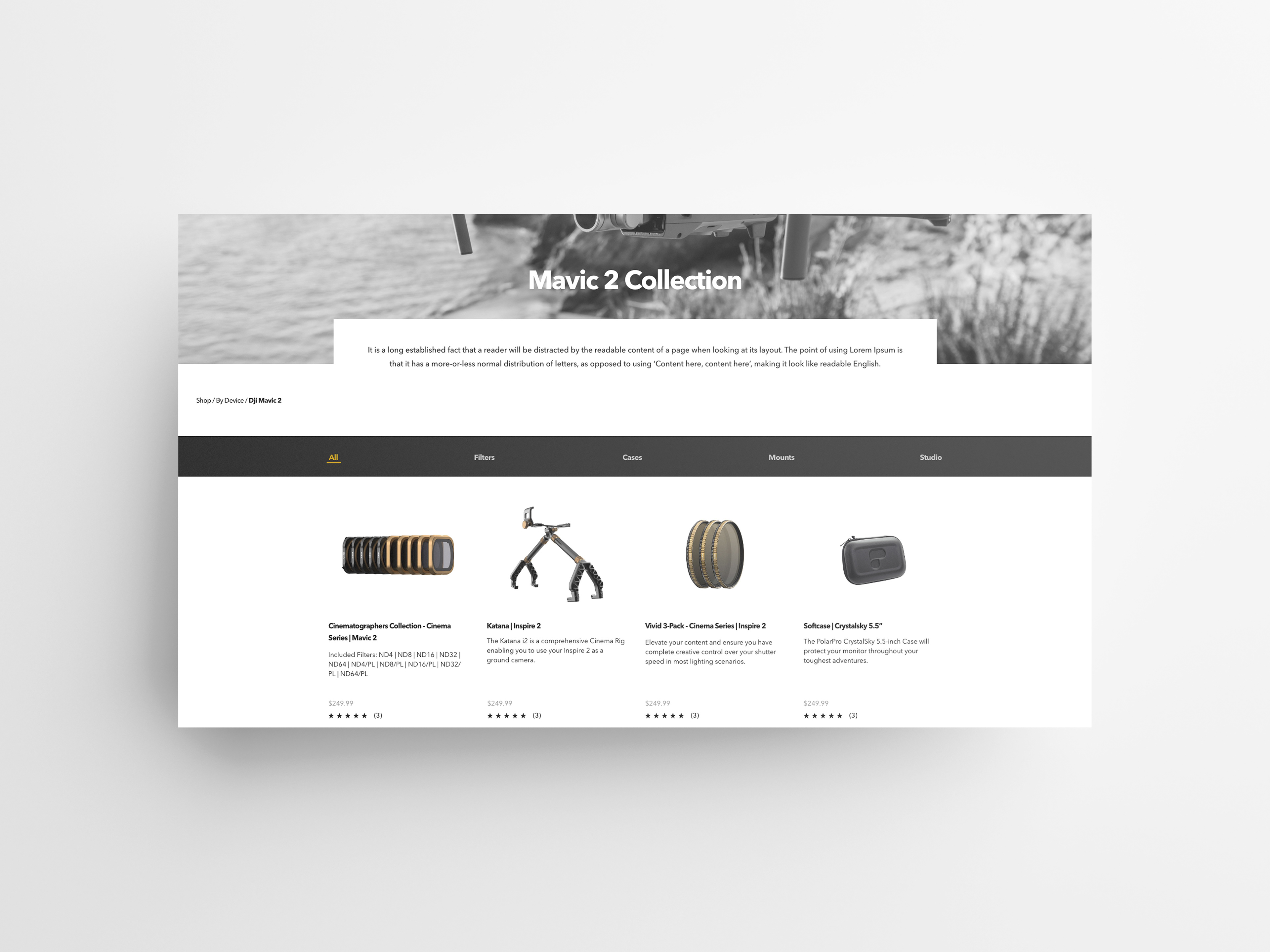
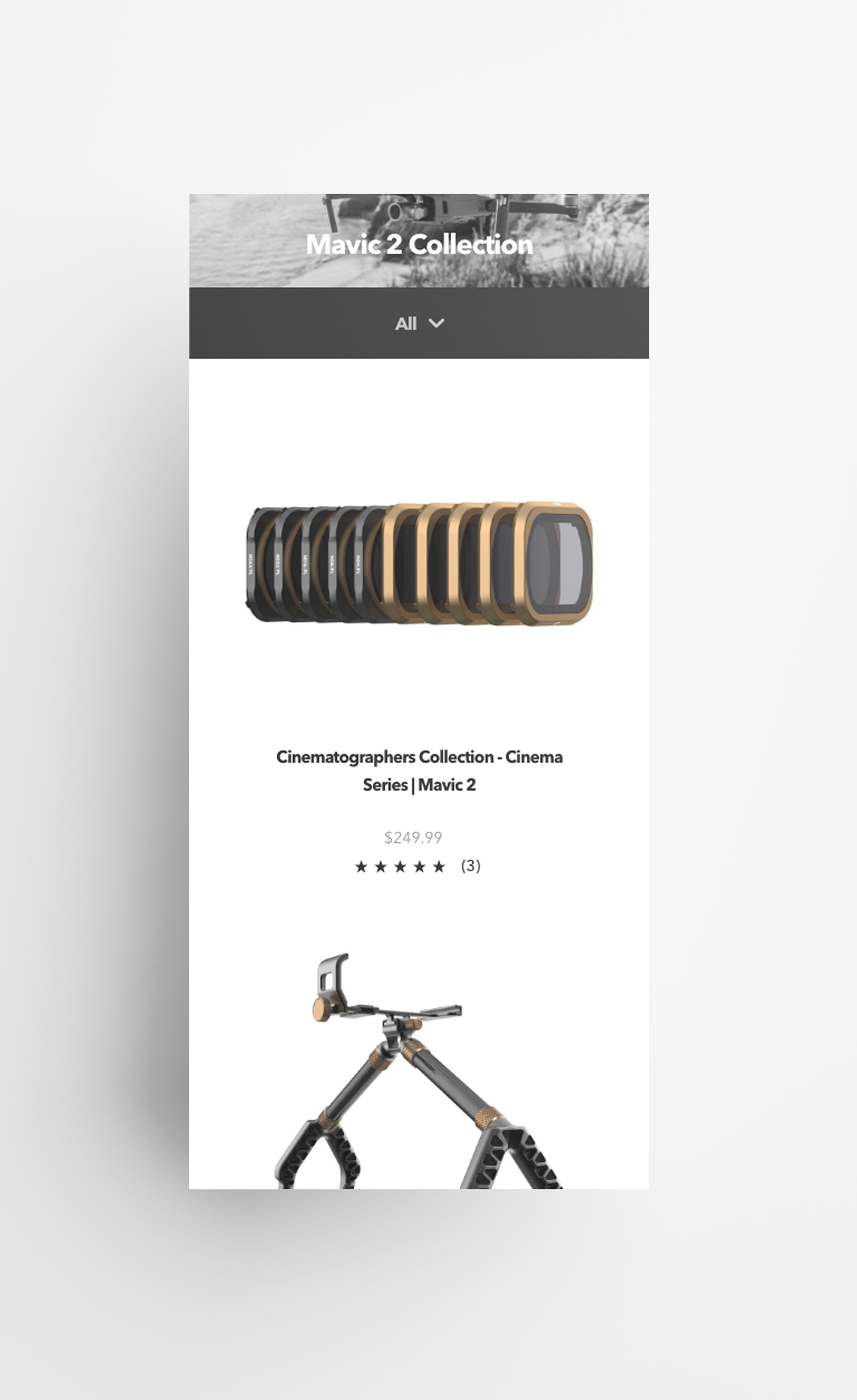
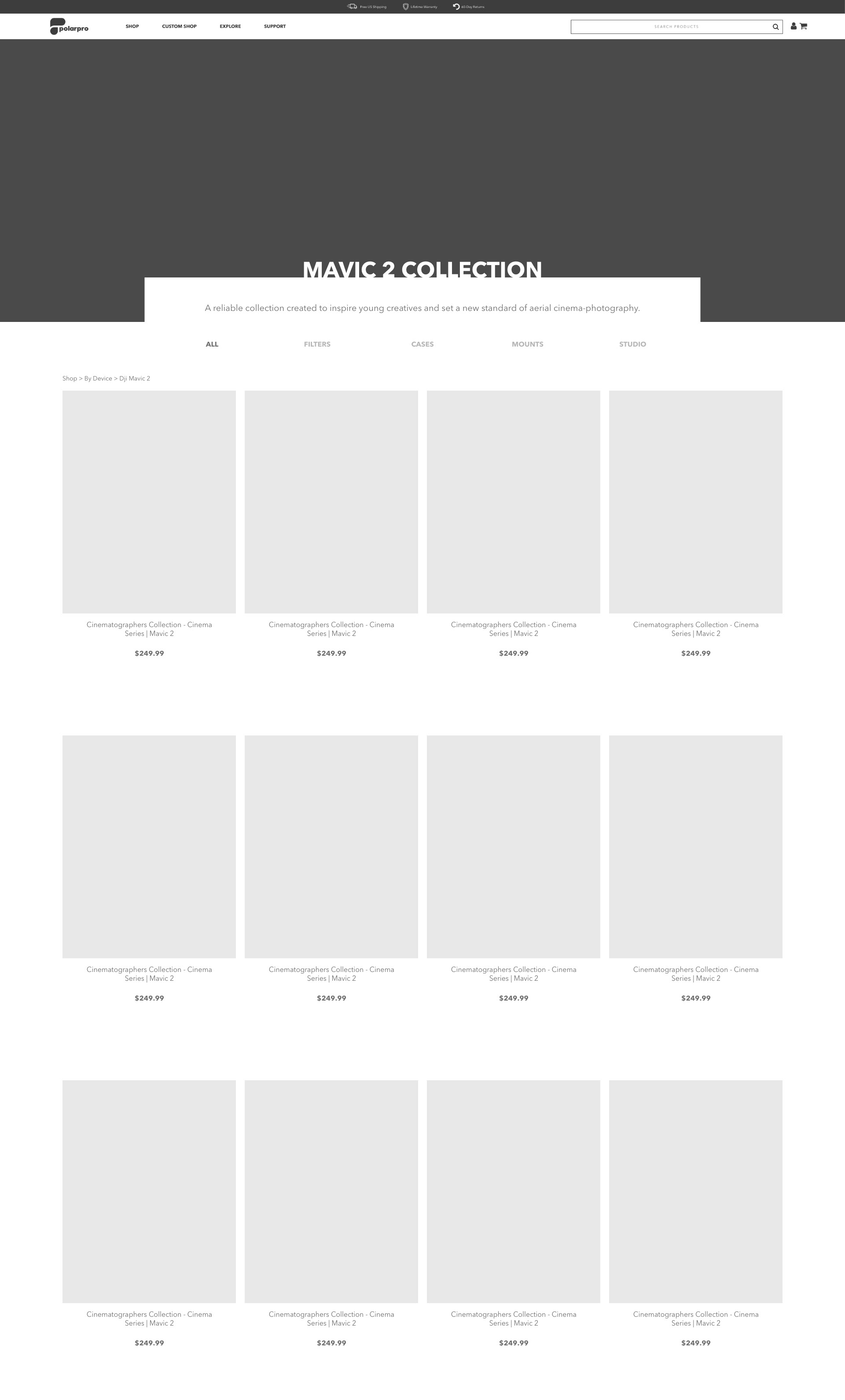
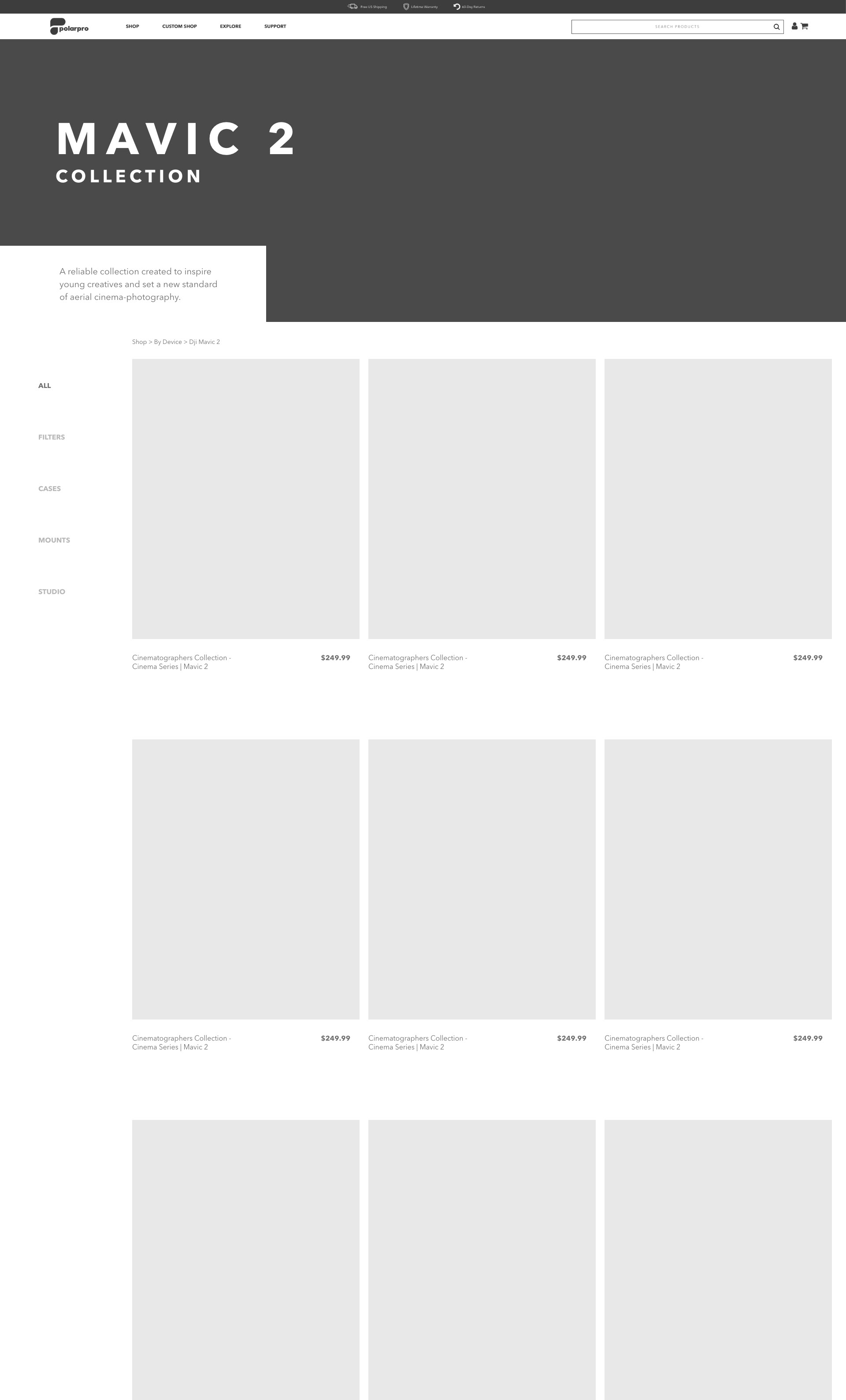
The main concern through this project was improving the mobile experience of the product collection pages since type sizes were too small and the layout was inconsistent. The collection pages were lacking details about each collection that could help novice photographers know they are on the right page to find what they need.
My Solution
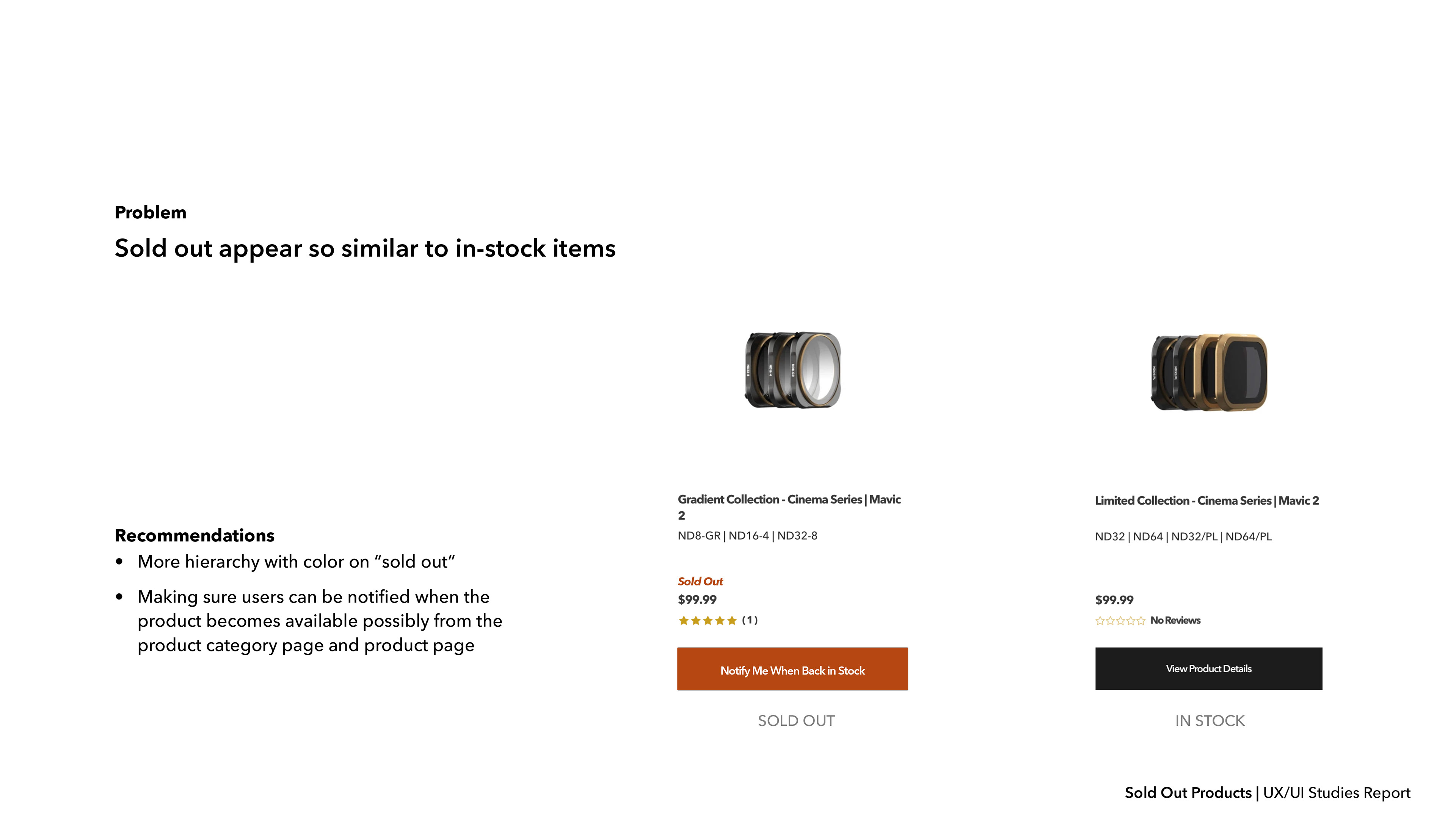
I created a sticky sub-navigation bar on the collection pages to make for easier browsing in between categories. I enlarged the "View Product Details" button and type size overall on mobile and desktop pages to accommodate our target users. Breadcrumb navigation was added to each page.
Research
Finding a way to help users stay in the loop when products are sold out.
Wireframing and Prototyping
Navigation is easy when you can stay on the product page.
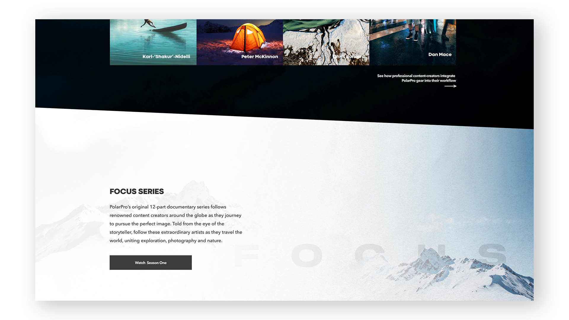
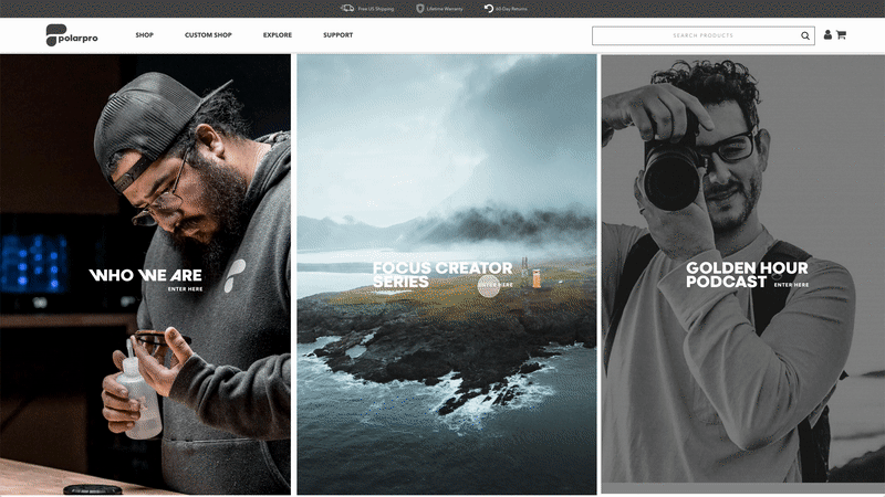
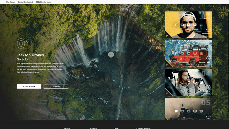
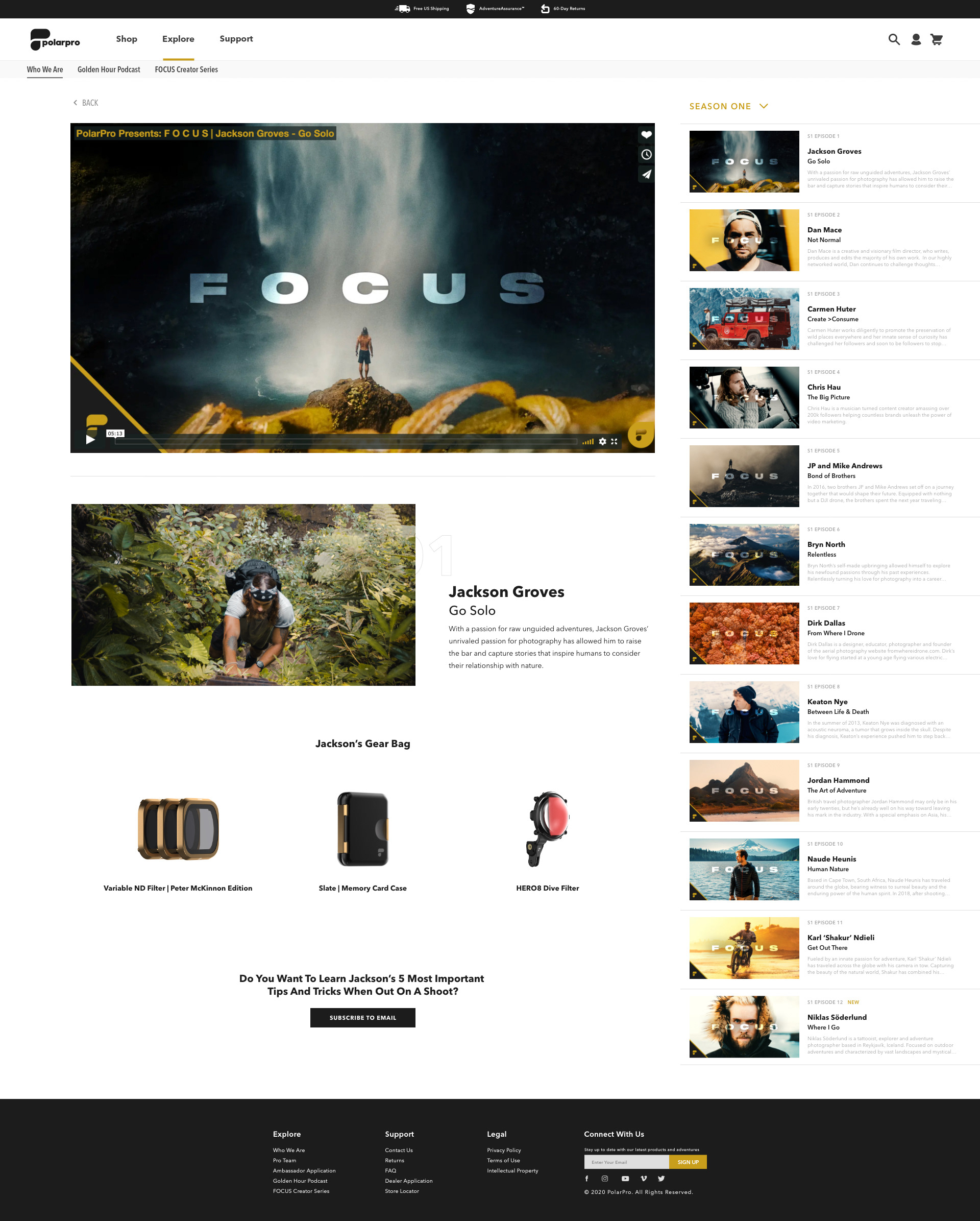
Explore Hub Redesign
Find inspiration through Golden Hour Podcast and Focus Creator Series.
The Problem
The main goal through this redesign was the creation of a landing page that would house all episodes and seasons. The challenge was creating a playlist in the detail pages that would contain the rest of the seasons thumbnails in a media player format.
My Solution
On the landing page, I had each creator’s photography cycled through at the bottom of the page on refresh to add an element of surprise. On the detail pages, I connected the guest’s gear back to products that the creator used while shooting their content.
Focus Creator Series Redesign
Get lost for hours in the action packed videography series from creators around the globe.
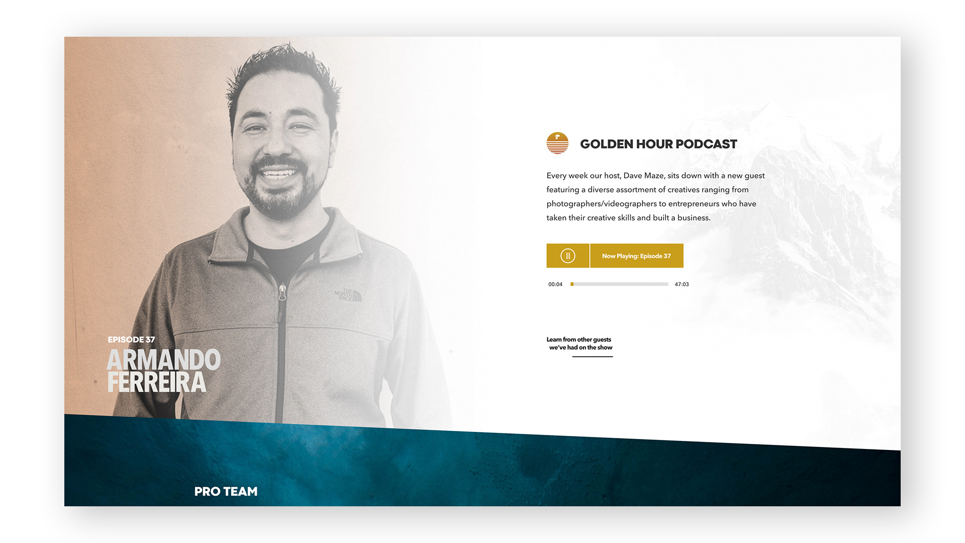
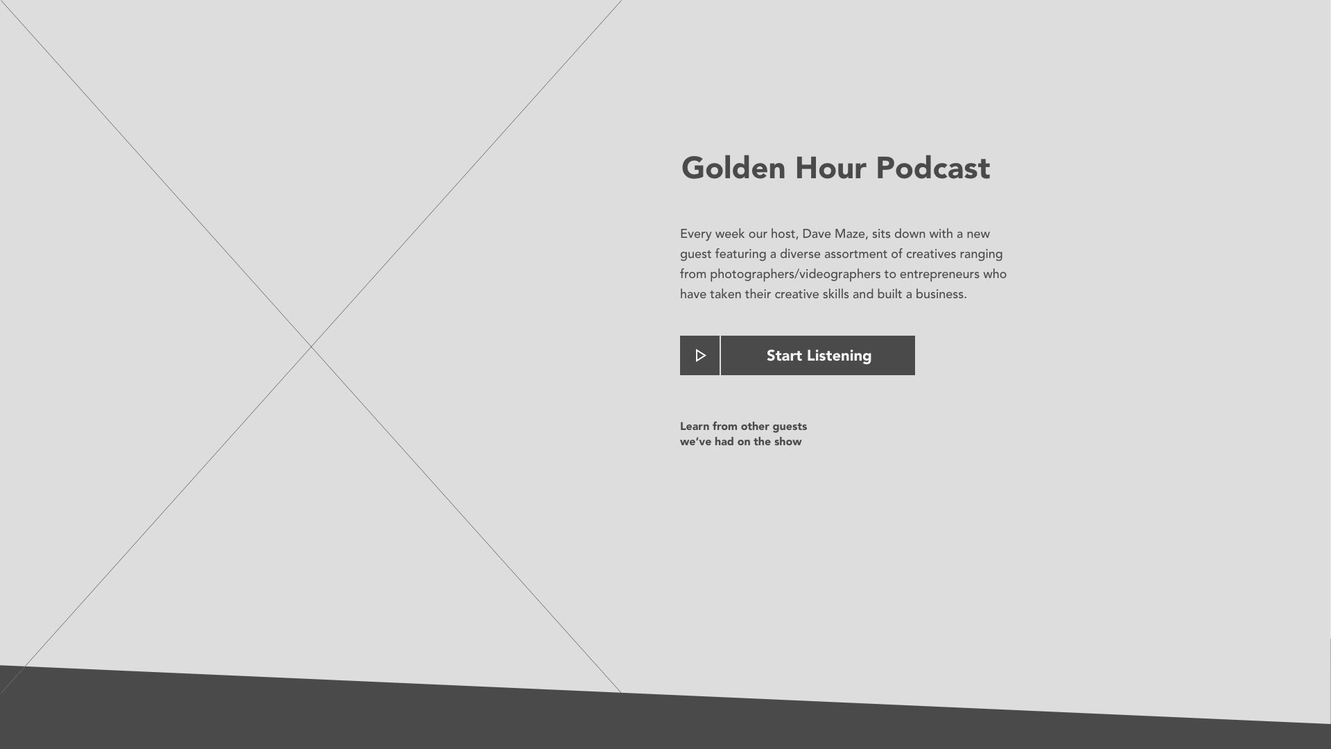
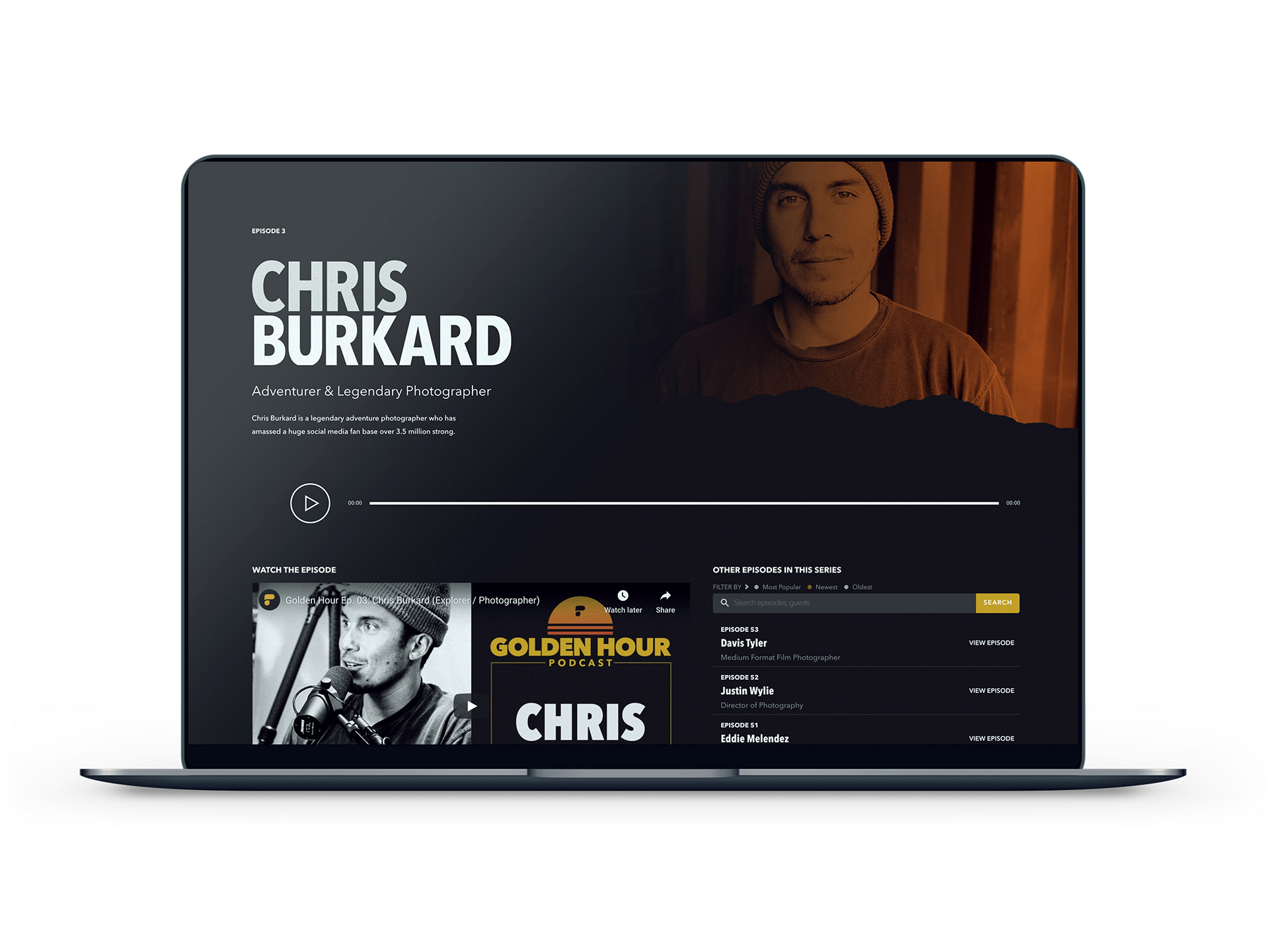
Golden Hour Podcast Redesign
With New Episodes Every Week, You Will Never Run Dry On Creative Inspiration.
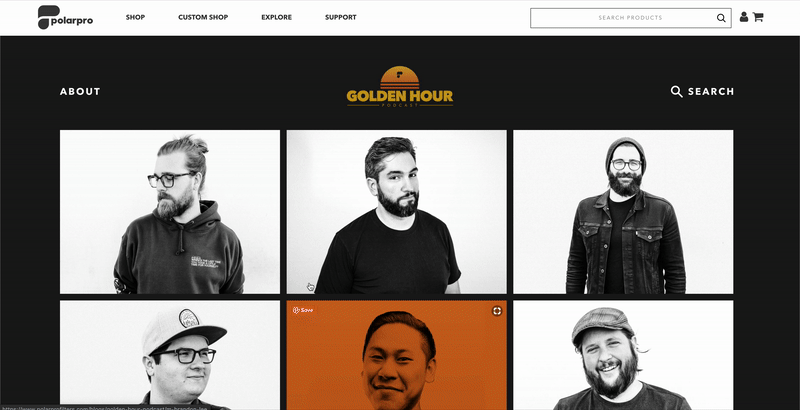
The Problem
The problem with the old version of the page I was redesigning was that you couldn’t listen to the episodes on our site. I wanted to give users the ability to listen and watch right from the web pages. It was a challenge keeping consistent with the quality of assets provided from the photographers, but we managed to seamlessly produce new episodes.
My Solution
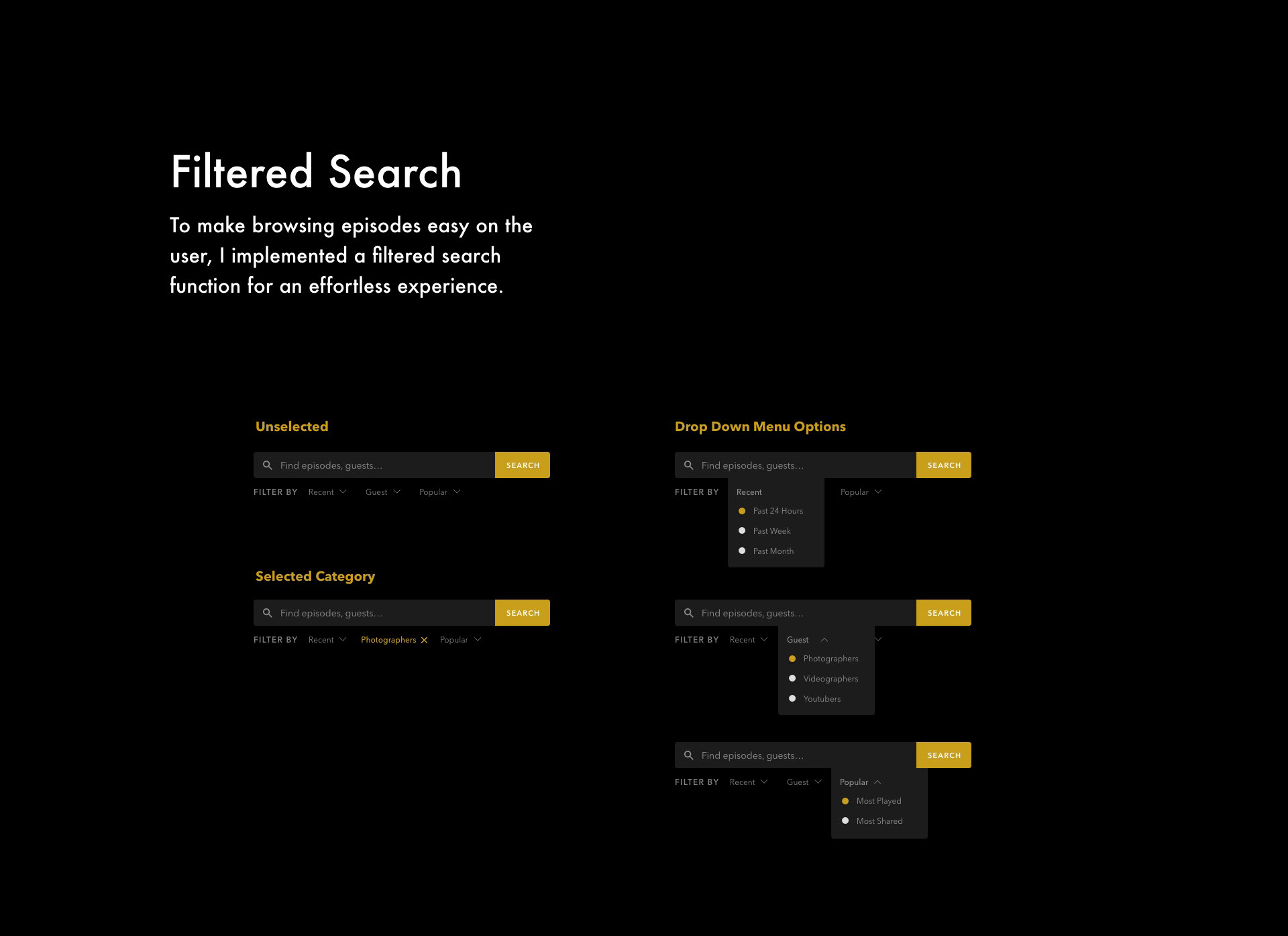
My solution was to create detail pages for each episode guest that would be updated weekly. I wanted to go for a vintage, film camera inspired aesthetic because of the professional background of guests they had previously. The search function was also added to the home page for effortless binging.
Support Hub Redesign
Focusing on improving efficiency for our customer support team.
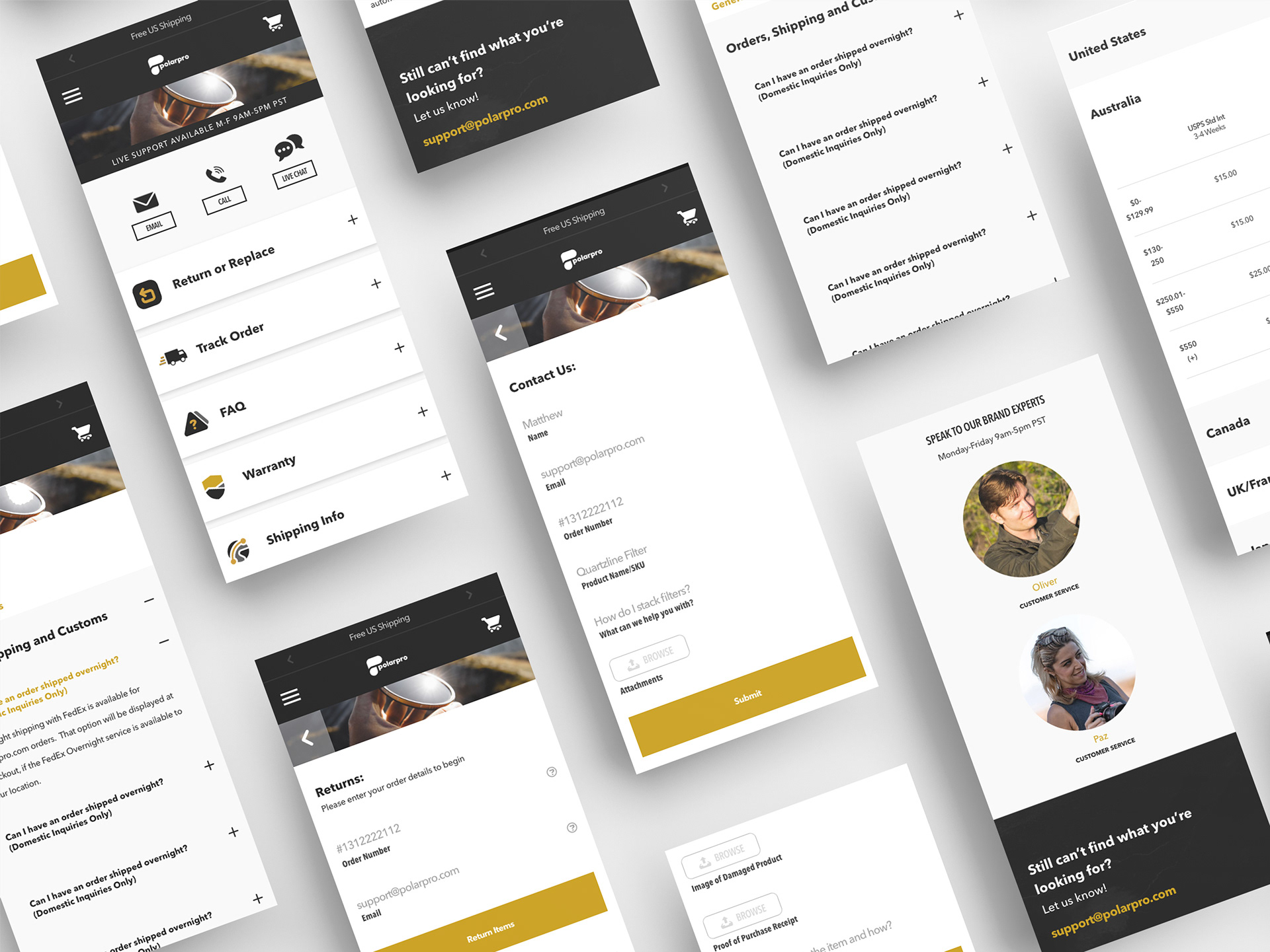
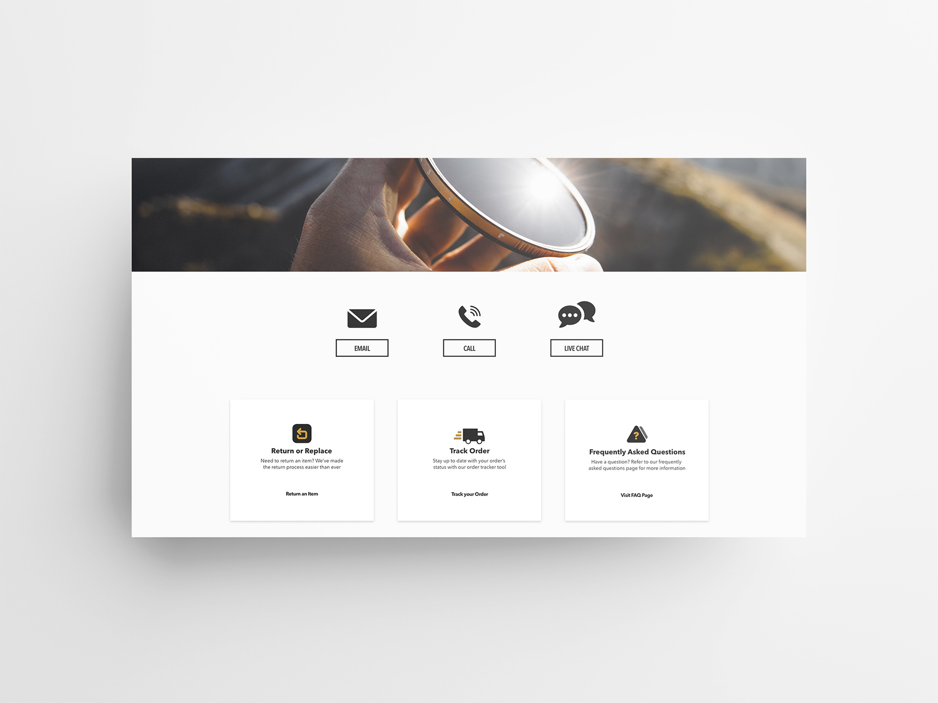
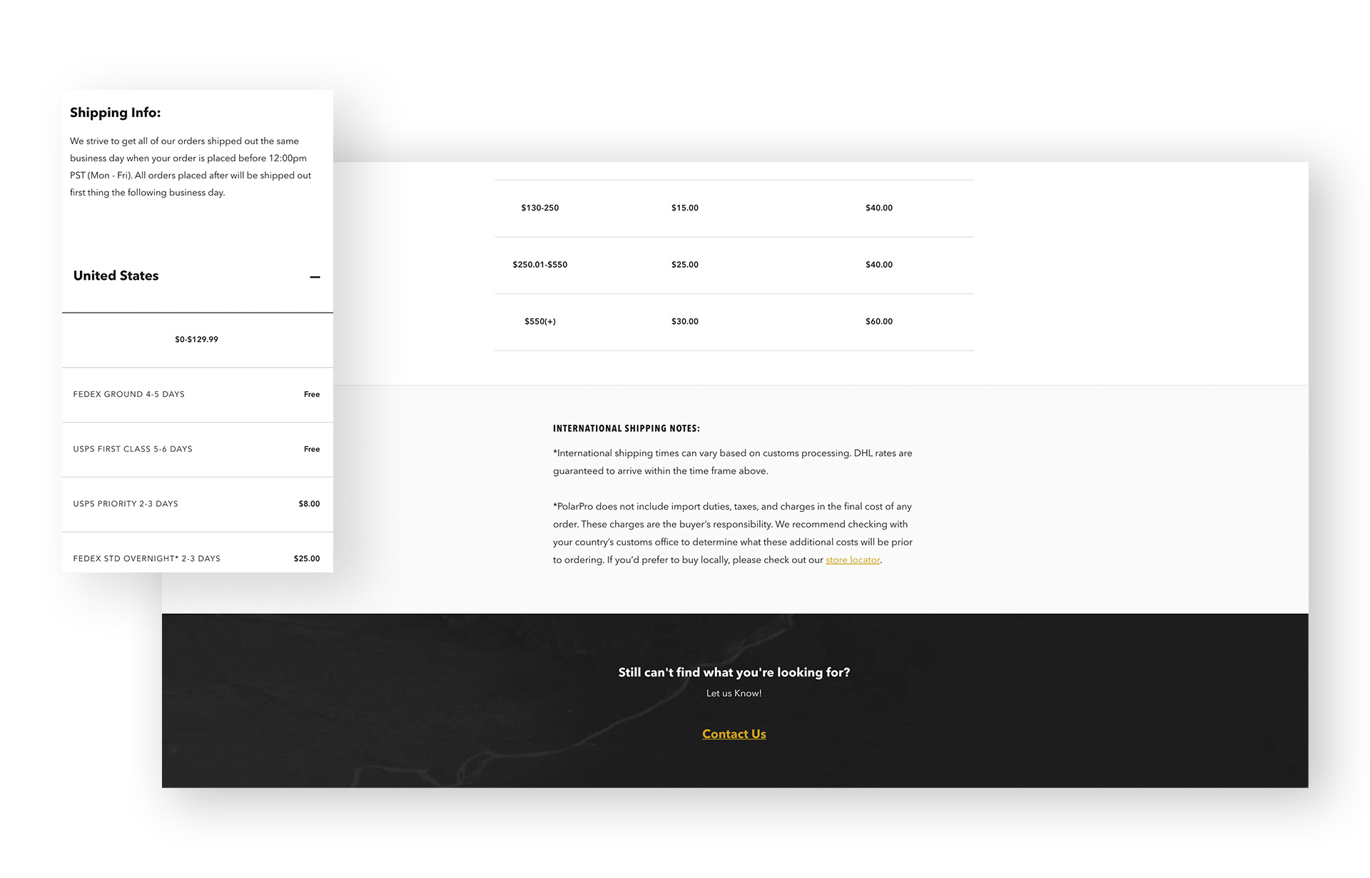
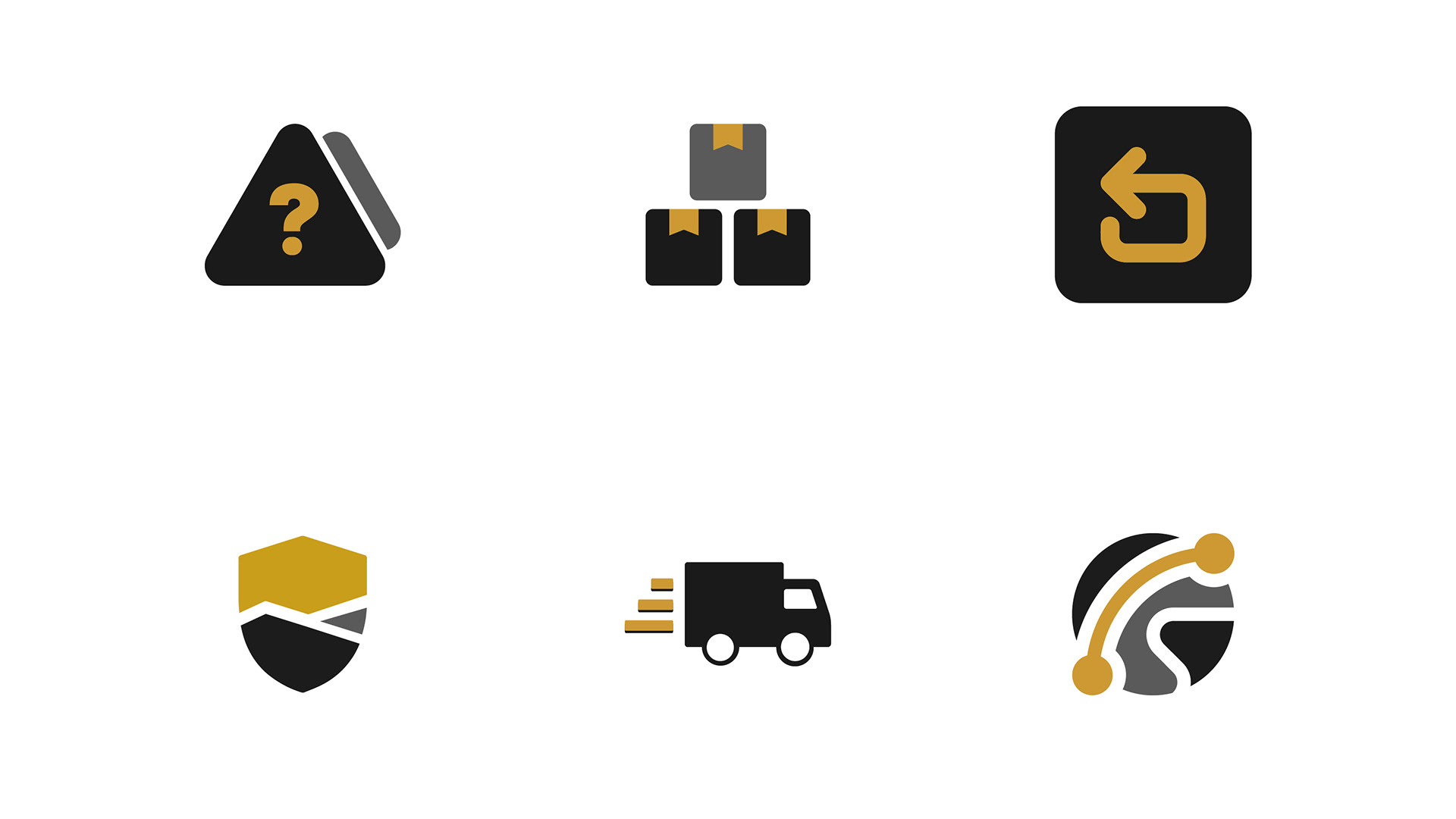
Iconography
To help users find that they are looking for right away.